Blog
The Psychology of Colour in Workplace Design
It’s an interesting idea, and one which businesses can learn from in order to inform their own design decisions. In fact, many businesses already choose their office colour based on the psychological impact it will have on their staff.
If you’re about to embark on a refurbishment project, read on to discover which colour will best suit your company’s needs. Could it be a colour you least expect?
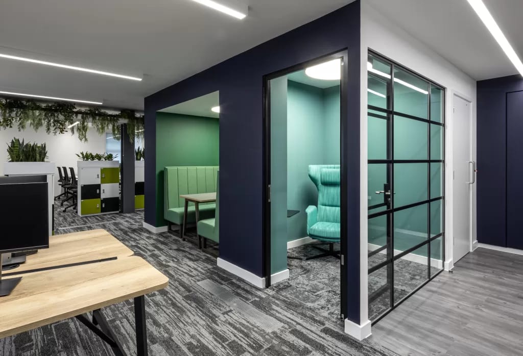
GREEN
Green helps to instil a mood of peace and harmony to your workplace due to its connection with the great outdoors. In addition to this, the calm and balanced nature of green is said to spark creativity
If your company has creativity at its core, then green is undoubtedly an intelligent choice. It will also work well if your company has an eco-friendly ethos due to the way it reconnects people with nature.
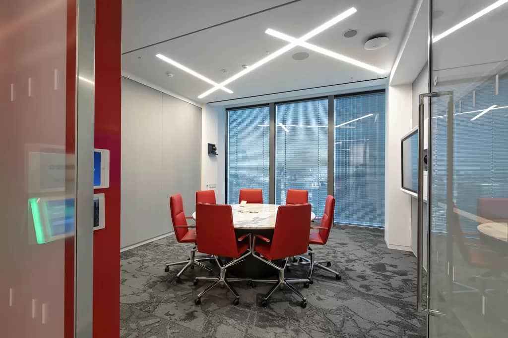
RED
Red increases pulse rate, blood flow and can heighten emotions Therefore, it not ideal for workplaces unless your job or task involves physical activity.
For companies where analytical thinking is central to their working practices, red should be avoided at all costs. It is also very loud and distracting, so can lead to employees getting eye fatigue.
BLUE
Like green, blue is a serene and calming colour. With connotations of efficiency and logic, it is perfect for fostering a productive working environment.
Soft blue, in particular, is a popular choice for workplace design due to the way it calms the mind and aids concentration. It is also very versatile and will work in corporate and creative offices alike.
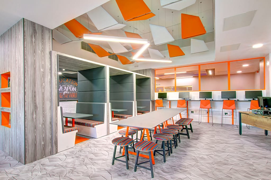
ORANGE
Orange is a colour that many would dismiss as being too garish. However, it is growing in popularity because of its warm, soothing qualities and the way it instils a sense of fun. It is a happy colour and can be just the thing to lift the mood in an office
For offices with a young, vibrant and fun team, orange could be just the thing to reflect that identity. It is also very spiritual colour – think the Dalai Lama’s robe – which would fit perfectly your company places great importance on staff wellbeing.
WHITE
Employees are said to be happier and more productive in a bright, roomy environment, and white serves to heighten a sense of space. Therefore, white is ideal if you’re looking to improve employee wellbeing and, in turn, boost productivity.
White is also a good way to take the edge off a harsh primary colour. So, rather than lathering your walls in a block of red or royal blue, combine the two to create a congruent and balanced combination.
THANK YOU FOR READING
Of course, psychology needn’t be the only thing to inform your colour decision. Like countless other companies,
you may simply want to go for a scheme which reflects your brand colours. If you are struggling to decide on a colour scheme, however, thinking about its psychological impact on employees is a great place to start.
Chris Sparham is the Marketing Manager for Rap Interiors, a major design, refurbishment and fit out contractor based in the South East. Since 1988 Rap Interiors has been helping businesses and schools to grow and improve with cutting-edge design transformations.
Popular Posts

April 19, 2024

April 9, 2024

March 22, 2024

March 12, 2024