Blog
Colour Rendering – How we see colour
To understand the importance of colour rendering, we first need to understand how we see colour.
When we look at an object, the colour that we perceive it to be depends on two things:
- The colour of the object itself (the car, food, painting or book, for example)
- The colour rendering ability of the light that is hitting the object.
The object will only reflect the wavelength (colour) of light that is the same colour as the object itself. For example, red surfaces will only reflect red – the other colours in the light are absorbed by the surface, so the only light that our eyes receive is red and so our brain recognises that the object is red.
White surfaces will reflect all wavelengths of light.
Black surfaces will absorb all wavelengths, and reflect none.
This is a chart showing the colours that would be reflected from a green apple, and from a strawberry:

Notice that both objects reflect the infra red at the right hand side of the chart
Because of how we see colour, for a light source to be able to render the colour of an object – that colour must be in the light source. If the light source has colours missing, or at very low levels, then objects won’t be able to reflect that wavelength, and so the colours of the objects you are looking at will appear dull, muted and of low saturation.
Traditional low pressure sodium streetlights are a very visible example of this. Because there is no other wavelength of light apart from orange in the source, if you see a blue, green or red car under those conditions, then all those cars would look a murky brown colour. White cars look slightly orange, as do yellow cars.
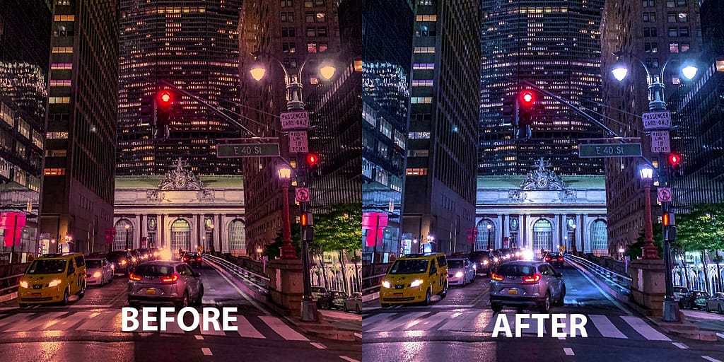
These streetlights have a low colour rendering index – they do not show colours anywhere near how they would be viewed under daylight conditions because they only give out orange light. Streetlights are being changed over to LED sources across the country, and the difference in how the two light sources render colour is shown nicely in images like these:
This is a very visual example, but there are other light sources which may appear white, but might have low levels of certain wavelengths in, which could affect how we perceive certain colours. If you have read the article about How LED’s Work, that explains that LEDs create blue light and pass this through a phosphor to spread the energy throughout the visible spectrum. The LED and phosphor have to work in tandem to ensure that the visible wavelengths are created correctly to ensure sufficient quality of light throughout the entire visible spectrum.
What is the Colour Rendering Index?
To rate the quality of light, and compare the quality of light between sources, the Colour Rendering Index (CRI) was created. The Colour Rendering Index shows the ability of a light source to accurately represent the colour of an object in relation to daylight. The “Commission Internationale de l’éclairage” (CIE) introduced colour rendering and used the colours below as the test palette. If the source under test renders the colour identically to how daylight renders it, then it will have a CRI value of 100 for that colour.
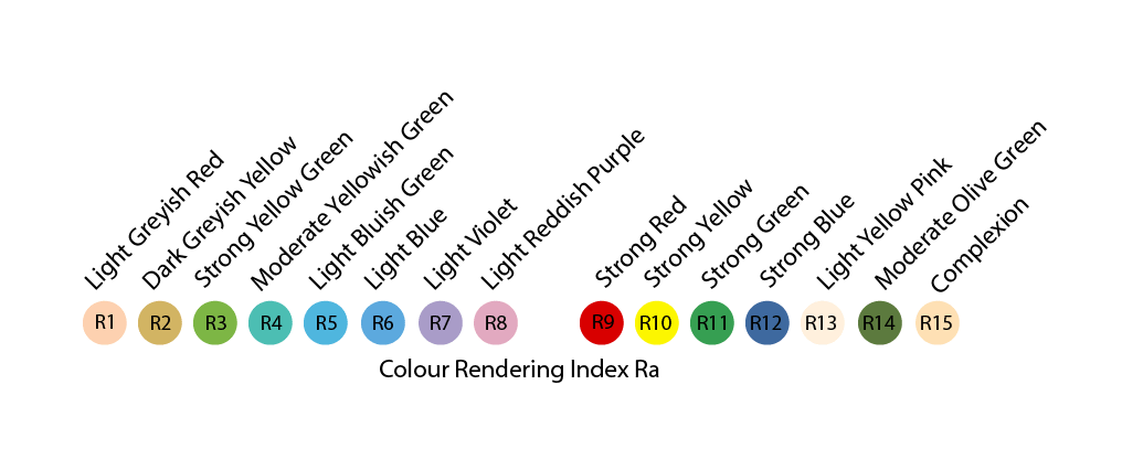
The results of the first 8 colours are averaged, to give the Colour Rendering Index, or Ra value. The remaining 7 colours are known as the “Extended CRI” these are used very infrequently.
You notice that the first 8 colours are all pastel shades, and not strong, saturated colours like some of the extended CRI colours. Because of this there are arguments that CRI is not an accurate way to represent a light sources colour rendering ability, and so alternative methods have been proposed, such as TM30, which we will cover in a later post.
For general office illumination, BS EN12464-1-2021 specifies a colour rendering index for luminaires to be Ra > 80.
In other projects, the level of required colour rendering may vary depending on the area that is being worked on. An art gallery would require a higher colour rendering index than car park for example, so that the art works can be shown in the most accurate way.
Popular Posts

April 19, 2024

April 9, 2024

March 22, 2024

March 12, 2024